OneStream recently released version 6.8 of our platform, designed to drive speed and flexibility for financial and operational planning and reporting. This release is all about improving the user experience for our customers, from enhanced ease-of-use capabilities with new chart types to an enriched Financial Class Functions experience. Additionally, OneStream 6.8 features a powerful new capability called Drill to Dashboard.
Read on to learn more about these capabilities and how they can help organizations like yours plan and report with more speed and flexibility than ever.
Supporting eXtended Planning & Analysis (xP&A)
OK, let’s cut to the chase with the most powerful new feature in the 6.8 release. Drill to Dashboard is part of the broader effort to further improve the OneStream user experience for eXtended Planning & Analysis (xP&A) use cases.
Here are a few of the core requirements driving our newest innovations:
- Corporate performance management (CPM) applications inevitably evolve to keep pace with the growing need for enhanced planning and Finance storytelling. That growing demand for enhanced planning and storytelling leads to more granularity and a continued need for scalability and performance for planning and reporting on larger volumes of more detailed data.
- As organizations optimize and enhance their applications, the natural evolution can drive the need for easier access to reference data from dashboards, such as linked Cube Views to access more detailed data in BI-Blend tables or the relational register.
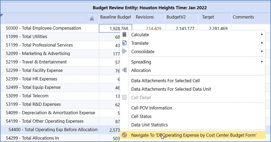
To address those realities, Drill to Dashboard now opens the door to many possibilities for data lineage analysis and data exploration. This added functionality will help to eliminate the need for users to incorporate too much detail in a single Cube View and/or Dashboard. Instead, users can now “navigate or drill-to” the details as needed (see Figure 1).

If you’ve ever felt the challenges of tracking down specific data for management reporting, you know the pain of jumping from one report or dashboard to another. Or realizing you think you know what data the Dashboard or Cube View contains only, to find out you were wrong. Sometimes a seemingly simple request can take hours, if not days to fulfill due to data not easily being accessible.
Drill to Dashboard enables users to quickly and seamlessly obtain the slices of data required for planning or reporting – and do it at speed.
For example, with Drill to Dashboard, users can quickly pass parameters from a Cube View to Dashboard for fast, focused reporting and analysis. Users can also link multiple Dashboards and link Dashboards at different levels, leveraging the entire Cube View or specific Cube View Rows or Columns for planning or forecasting.
In other words, Finance teams and business analysts can continue to focus on delivering the data needed to drive enhanced reporting, informed decision making, and improved business performance.
Below is a quick summary of additional features available in OneStream 6.8 and the benefits to all customers.
New Financial Class Functions
Users can do more calculations with the Microsoft Financial Class suite of functions. Now available in the Business Rules Editor, users can take advantage of the class procedures that perform financial calculations, such as depreciation, present, and future values, interest rates, rates of return, and payments.
Ease-of-Use Features
The New Chart Types in the Spreadsheet within the OneStream Windows App offers powerful features in the OneStream platform that enable users to transform data into better insights by quickly visualizing common financial, statistical, and hierarchical data. In OneStream 6.8, we introduced seven powerful charts providing users the ability to explore data and tell richer stories.
Here are the new chart types and the benefits users can expect:
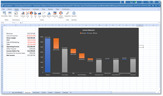
Waterfall chart quickly illustrates the line items in financial statements and gives users a clear picture of how each item is impacting the bottom line. The Waterfall chart is a great way for users to get a complete picture of how different factors combine to achieve the “final result.” Comparing product earnings, showing budget changes over time, or illustrating employee growth are all good examples of ways users can benefit from a Waterfall chart (see Figure 2).

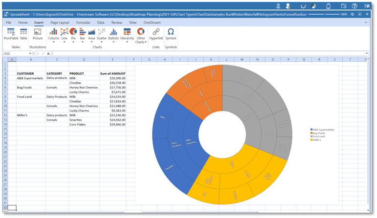
Sunburst chart lets users easily see the largest contributing segments within a hierarchy of multiple levels. The Sunburst chart shows hierarchical data and their proportions, but it can also show more levels and how a ring is broken into contributing pieces. For example, through the Sunburst chart, users can better understand revenue sources of your business or salary expenses of employees across departments (see Figure 3).

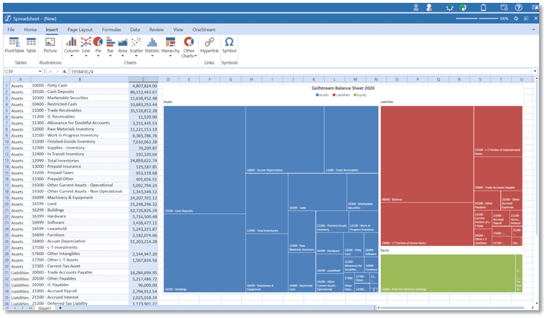
Treemap chart provides a hierarchical view of user data and an easy way to compare different levels of categorization. Treemap charts are great for highlighting the contribution of each item to the whole, within a hierarchy. Making it easier than ever to spot patterns or compare proportions and relative sizes. Representing balance sheets in a Treemap chart, for example, offers very quick insights on how the company is financed (such as debt rather than equity) or where the largest portion of assets lies (see Figure 4).

Other new chart types introduced in OneStream 6.8 include the following:
- Box and Whisker plot provides users with key insights about the distribution of data from different categories. Including range, quartiles, mean, and outliers.
- Histogram chart helps users analyze the characteristics of a large amount of numeric data, through a graphical representation of its distribution.
- Pareto chart lets users sort the frequency of the most prevalent issues (the bar graph). Then shows the additive contributions of each issue as users move along the horizontal axis (the line graph).
- Funnel chart lets users visualize the progressive reduction of data as it passes from one phase to another.
Learn More
If you’re an existing customer looking to learn more, check out the OneStream 6.8 release notes on the OneStream MarketPlace. Not yet a customer? Sign up for our upcoming webinar or another upcoming event.
As your FP&A team begins the xP&A journey, download our whitepaper to learn more about the key factors that are critical for effective xP&A.
Get Started With a Personal Demo


